Los Angeles recently revealed their 2028 Olympics logo. It is not unusual for cities to release their branding so far in advance of the games — but what isn’t usual is the positive feedback the logo received.
So what makes LA’s logo different from games past?
Olympic Game logos have long been a source of controversy. From plagiarism to designs that are difficult to read or look oddly familiar, most are criticized by the millions who tune into the games each season.
The artists left to right: Olympic Snowboarder Chloe Kim, Jorge "Joy" Alverez-Tostado of Tacos 1986, actress Reese Witherspoon.
The 2028 logo, on the other hand, has been widely praised for its unique design. Faced with a challenge to represent the dynamic city of LA while also creating a visual that can withstand the eight-year wait leading up to the games, the committee looked to local creators across LA and the Olympic network. The resulting creative features a rotating “A” that features different interpretations of the city from a diverse set of designers — providing unlimited opportunities to resonate with athletes and spectators.
The logo succeeds in large part because it was created by individuals who live and breathe the culture behind the logo every day. It does not force the design to be stagnant, but a living, moving symbol of the city. And while a continuously evolving logo is not the right fit for all brands, this approach to graphic design ultimately wins over its audience because it directly reflects their unique values.
Currencies driving today’s designs
Graphic design succeeds when it translates audience values into a visual that resonates. This can feel like a moving target — especially today, as values and beliefs are challenged in the face of disruption.
As we head into a new year, several design currencies are emerging as a direct result of recent national and global events. Exploring how these design styles can positively impact your graphic elements can help your brand remain relevant during a time of change.
1. Nature-inspired and environmentally-conscious designs
COVID-19 has provided a stark look at each person’s environmental footprint — and how conscious efforts can help reduce our impact. And as a result of pandemic restrictions, more people are getting outdoors to value the beauty that only the nature can provide.
Fortunately, nature can be found all around us, making it easy to find inspiration for your brand. And it favors organizations striving to implement sustainable and eco-friendly initiatives to improve the way they conduct business.
Mindsailing has explored how a brand might name and design a new product around this currency.
Mindsailing has explored how packaging might look with a nature-inspired design, and sustainable practices.
Incorporating nature into your designs might include using more:
Soft and earthy colors and tones
Flowing lines
Organic forms
Textures
Packaging material, and ethical responsible supply chains are as much a part of nature design as the graphics.
Related Content: Explore these best practices for creating community-centered designs.
2. Cartoon illustrations
From politics to the pandemic, this year has presented a wide range new challenges. And for some businesses, adding light-hearted elements to marketing visuals could be a strategic decision to break up the noise of a world in disruption. The use of cartoon visuals can give your brand an approachable edge — while also providing fresh opportunities to visually portray your audience in new and diverse ways.
Mindsailing has explored how a website might look with cartoon-inspired design.
Incorporating cartoons into your designs might look like:
Being more playful with imagery and colors
Working to be multifunctional (e.g., pulling out elements for different marketing materials)
Incorporating new esthetics
Using mixed media compositions
Leaning toward a simple geometric style
Related Content: Advance your website with these four steps to a successful B2B website.
3. Type chaos and dystopia
Art and typography have been seen as a direct reflection of cultural and political times. Art Nouveau was a response to growing industrialization in Europe and a reflection of breaking from the past. Cyberpunk was a movement in the 60s and 70s that portrayed a society that struggling to keep up with technology and cultural change. Both of these, combined with original experimentation, are prevalent in design today as we live through new (but familiar) political and cultural disruption.
Mindsailing has explored how a futurist book might look with chaos-inspired design.
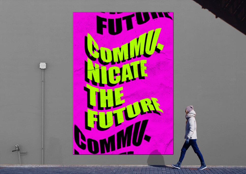
Mindsailing has explored how posters and event graphics might look with chaos-inspired design.
Incorporating these elements into your design might include:
Pushing boundaries (e.g., zero negative space, disrupting alignment)
Visual tension
Super-maximalism (e.g., exuberant letterforms and 3D distortion)
Ultra-minimalism: (e.g., tiny typographic nuances and stripping all excess)
Moody colors, neon letters and mesh gradients
Related Content: See how these communication currencies are helping businesses remain relevant during COVID-19.
Navigating the choppy waters of disruption
What works for one business will certainly not work for all. But a common goal remains at the foundation for visual exploration: creating relatable and relevant designs that fit the current tone of your audience. Remaining approachable and welcoming in a distanced world is just one more way you can positively contribute to your brand experience.
Want more ways to keep your business current?
Explore our emerging trend insights.


